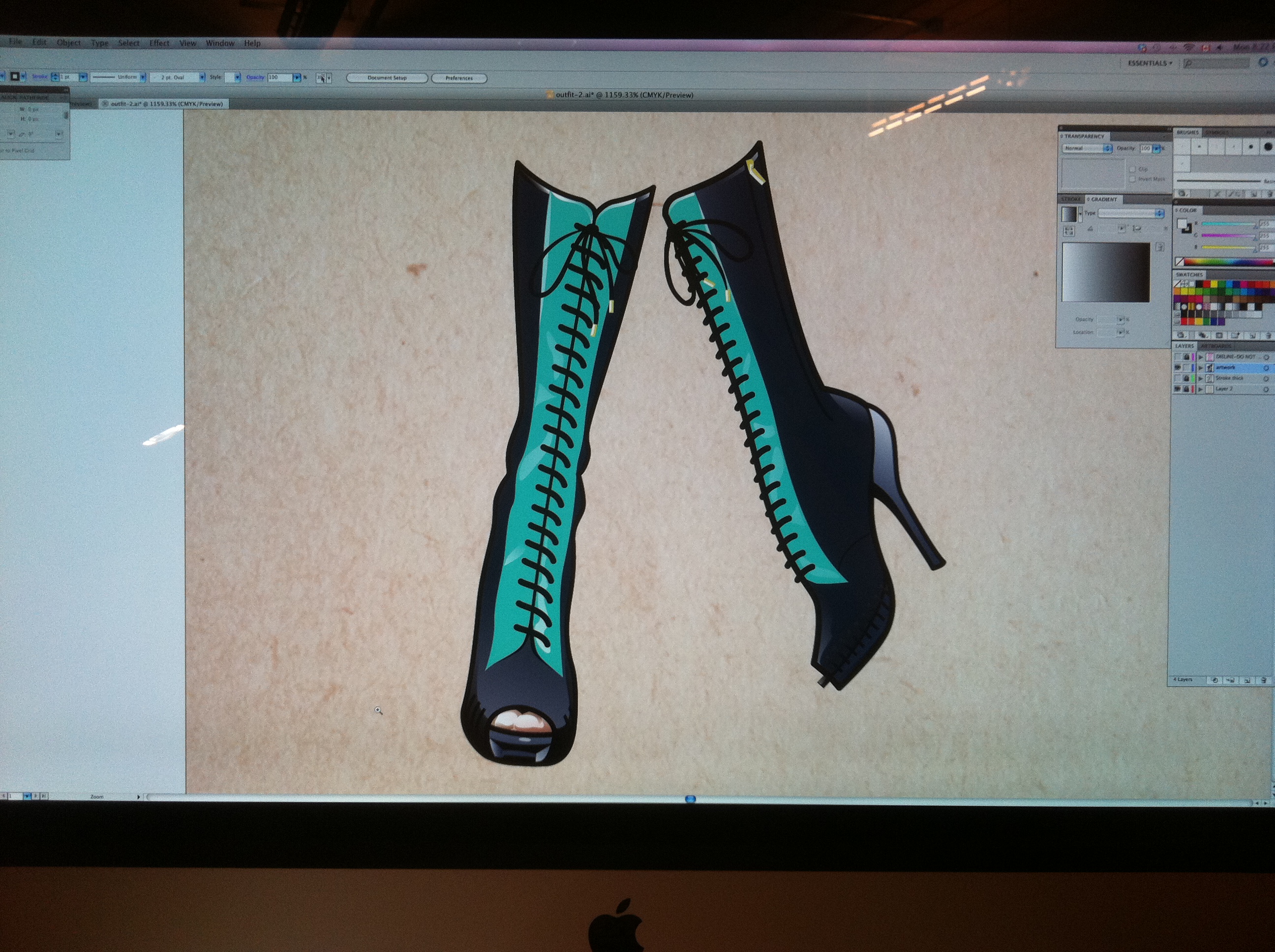
Currently working on this paper doll project for Antipasto magazine from Hong Kong. Clothing items include pieces from: Marc Jacobs, Vivienne Westwood, Givenchy, Hermes, and Versace.
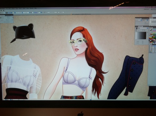
Almost done!
In Progress
Currently working on this paper doll project for Antipasto magazine from Hong Kong. Clothing items include pieces from: Marc Jacobs, Vivienne Westwood, Givenchy, Hermes, and Versace.
Almost done!
For lunch tomorrow. Art and tacos @la_carnita!
445 King Street West, Suite 201 (King & Spadina)
Read the article in Toronto Life magazine >
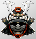
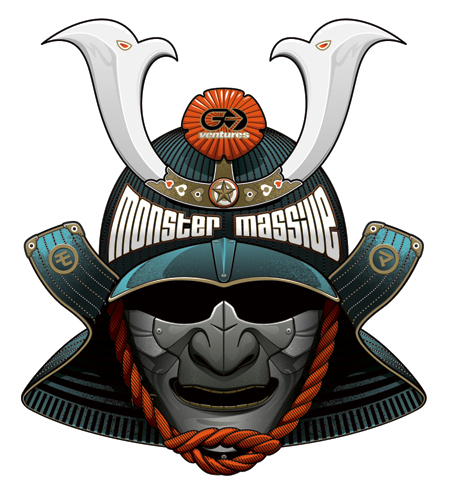
FINAL ARTWORK (by day & night)
Only change to the final was to make it more traditional with a black helmet.
Click below for larger image.
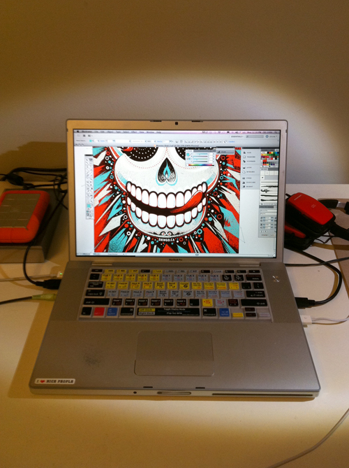
TRACING WITH VECTOR
Once the concept sketch was approved, I went ahead in Illustrator, to trace out the line work, laying in a basic colour theme.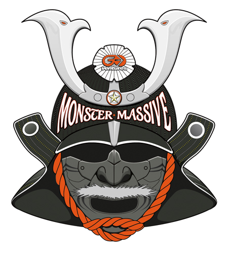
TYPE INSPIRATION
I forget the name of the placement font I chose here. The font of course, had to convey a samurai energy to it. I wasn't too happy with the font choice (please ignore the typesetting…) Conveniently, stuck with my problem, I hadHelveticaplaying on the TV, where it showed Wim Crouwel's 'Hiroshima' work.

TYPE #1
Right then, I thought 'perfect', and brought the grid up, and created my own version for 'Monster Massive'.
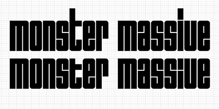
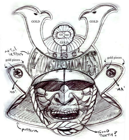
TYPE #2 AND MORE DETAIL
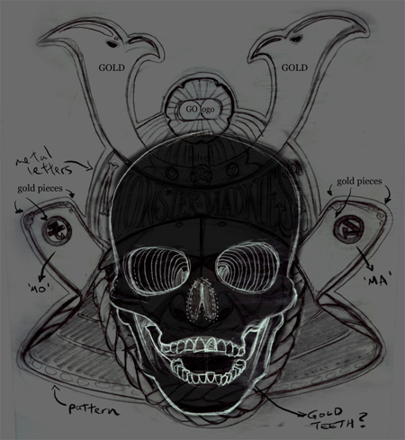
Then I warped the text onto the helmet, and further adding details. The left and right wings of the helmet include a crest like symbol in a circle. Obviously, I have made up one in this case (why not?). It's only a 'katakana' first letter of 'Mo' (as in Monster) and 'Ma' (as in Massive) to make it look like a crest of a clan.
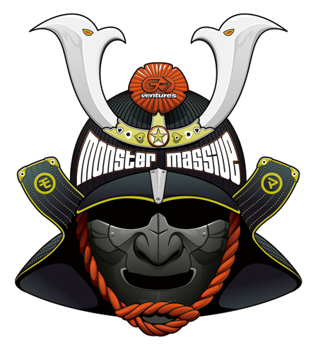
PRESENTATION #1A
At this point, the client decides to go with 6 colours: CMYK with Gold Metallic and Invisible UV inks. (before it was sort of up in the air.)
 I then jazzed up the art with more patterns and textures. I then go for a slightly progressive colour with an electric blue, that feels more clubbier. By the way, I've dropped the moustache, for gold teeth. I never knew why samurai masks had moustaches on them. Perhaps it was to show who's more man than the other?
PRESENTATION #1B
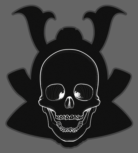
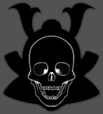
Anyhow, after I did all that, the skull artwork (the hidden image) was much more easier. I decided to treat most of the line work with dots, to give it a fun bling-like feel. I've also included 'Monster Massive' in the teeth. (All in the deets…)
I then showed the client for the first time, since the roughs.
When people say, "Hmph, I've seen your work.", it usually translates to, "Hmph, I've seen your end products.". That's great and all, since that is what I am paid to deliver. Yet I feel that when I show my portfolio (online especially), usually people are clueless (especially non-artist / designer types) to how you got to the end, and how much time it took to get there.So when people only see the end product, I sometimes wish I could show more and share the process to getting there. So here it is folks, my first 'In Progress' entry.
MM2009 (part 1)
So another Monster Massive (presented by GO Ventures) event is around the bend. Those of you that don't know, it's a giant rave party that throws down every Halloween at the LA Sports Arena in California. It gets more massive every year that it attracted over 65,000 last year. For their 12th event this year it seems that it will be the biggest yet, combining the LA Sports Arena, Grounds and Exposition Park. The Djs are unconfirmed at the moment, so check their site if you are interested in going.
FIRST IDEA
This is my third time, designing their 'mask flyer'. Since President Obama is so popular these days, especially with the youth, I really wanted to draw African American superhero, 'Falcon' (modified of course). I suppose it would be like a 'Black Power' type of thing. Then treat it in a washed out, comic retro style.
Falcon sketch with 'MM's in mask.
FINALIZED IDEA - A
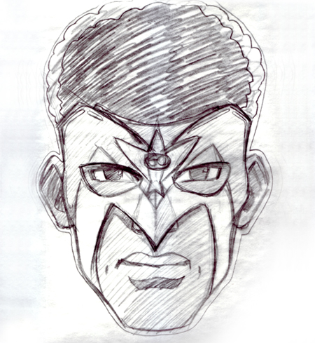
But…MM decided on a Samurai or Kabuki theme instead. I am not really a fan of Kabuki theatre. I don't really know anyone that is either. I am however a fan of Samurai (or Ninja) movies for that matter. I recommend: 'Lonewolf and Cub' series, 'Zatoichi' (the original series, not the 2003 one), 'Kill!' and '7 Samurai'. Anyhow, we decided to go with the Samurai theme being printed 7/4 (CMYK + fluorescent colour + metallic gold + invisible UV) and die-cut, as per usual. I've always wanted to do a 'Glow in the dark image', so I went with a skull, so it would be kind of a zombie samurai.
Samurai sketch
FINALIZED IDEA - B
Skull sketch > glow in the dark image